

A UX/UI case study documenting my full design process
Flowly is a mobile app I designed to help people build healthier daily routines through mindful logging, simple activity tracking, and achievable goals. The purpose of Flowly is to make wellness feel manageable, not overwhelming, by encouraging consistent habits in a friendly, supportive interface. This case study walks through my full process:
research → concept → sketches → wireframes → early prototype → improved color/interaction system → final prototype.
My Role: UX Designer, UI Designer, Interaction Designer
Tools Used: Figma, Notion
People want to improve their daily habits (sleep, self-care, reading, hydration ) but most wellness apps feel either too clinical or too complicated. Many require long setup times or give overwhelming charts.
I wanted to create a wellness app that feels: simple, warm, quick to use, visually encouraging; something a user could realistically return to every day
Core Goal:
Design a lightweight, visually friendly habit-tracking app that makes logging easy and shows progress in a way that actually motivates the user.
3. Discovery & Insights
Since this was an original concept, my “research phase” focused on:
Competitive scanning of apps like Finch, Stoic, Headspace, Flora, and Aloe Bud
Light feedback from friends/classmates on what frustrates them with wellness apps
Key Insights
- People want fast logging, not long forms.
- Clean visuals and color contrast matter; they help users interpret progress quickly.
- Users like daily goals, but also want to see weekly progress without too much data.
- Navigation should always feel obvious; what’s active, what’s not.
- “Logging throughout the day” is more realistic than logging everything at night.
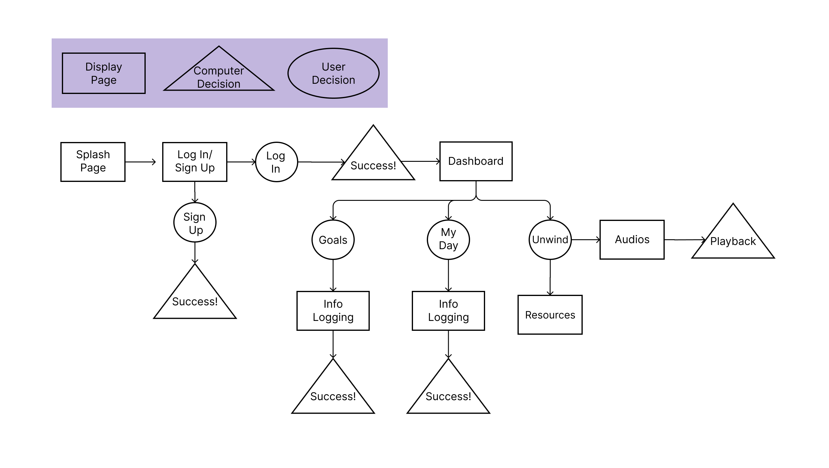
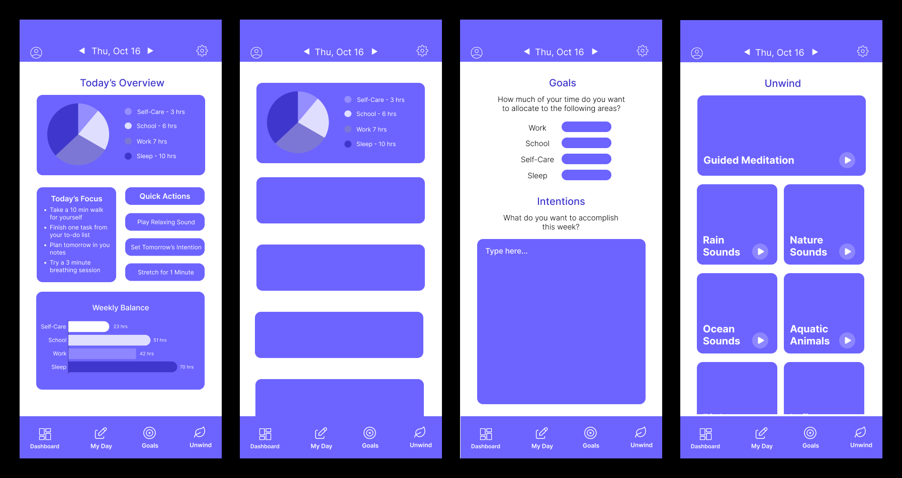
4.1 Low-Fidelity Wireframes /User Flow
I started with very low wireframes to explore:
- navigation layout
- the Daily Log structure
- a dashboard with an overview
- a simple bottom nav to keep things consistent
The wireframes defined layout and information hierarchy.
The main focus was:
- making each section modular
- keeping elements aligned and readable
- visual grouping through spacing
- card-based structure for clarity
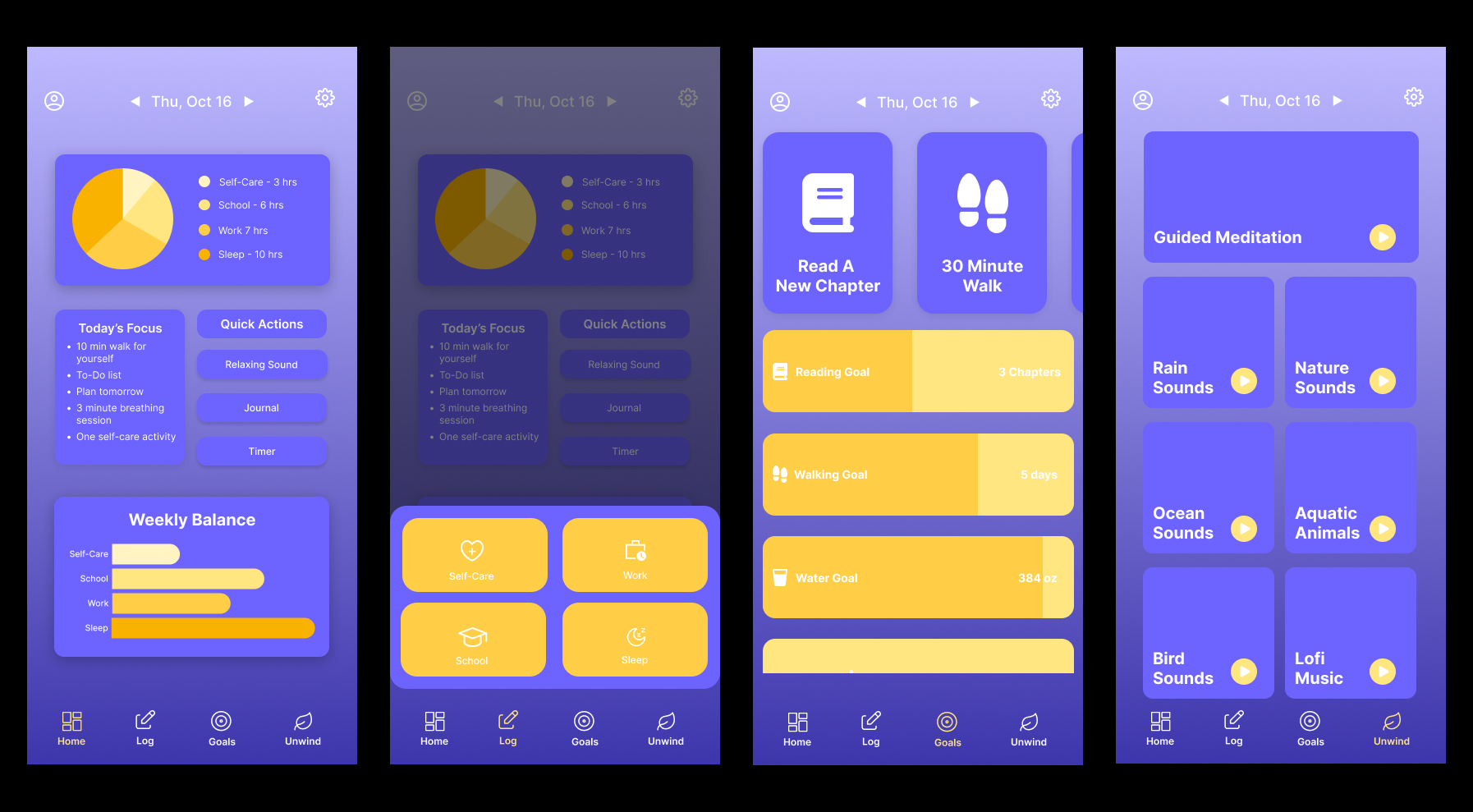
4.3 Version 1 – Initial Color & Layout Choice
The first version included:
-solid purple UI
- early button styles
- the first Weekly Balance bars
- simple Daily Log cards
- basic nav icons
After showing this version to peers and receiving feedback, I learned:
- the contrast wasn’t fully accessible
- the UI needed more depth
- navigation needed stronger state changes
- cards lacked interaction feedback
- color needed to help separate categories
This is where Flowly became more polished.
5.1 New Color System
- Kept purple as the main brand identity
- Introduced yellow as an accent color to highlight progress bars, goal completion, and active states
- Added shadows to give cards depth instead of a flat layout
5.2 Navigation Refinement
- Removed hover-based interaction (since mobile users can’t hover)
- Added click-based states: icons grow + change to the yellow accent when active
- Ensures the user knows EXACTLY where they are
5.3 Goals & Log Page
- Purple cards = daily goals
- Yellow cards = weekly goals
- Weekly goals update visually as daily goals are logged
- Each category has its own card (Sleep, Work, School, Self-Care)
- Users can add entries throughout the day
- More realistic and flexible than a single form
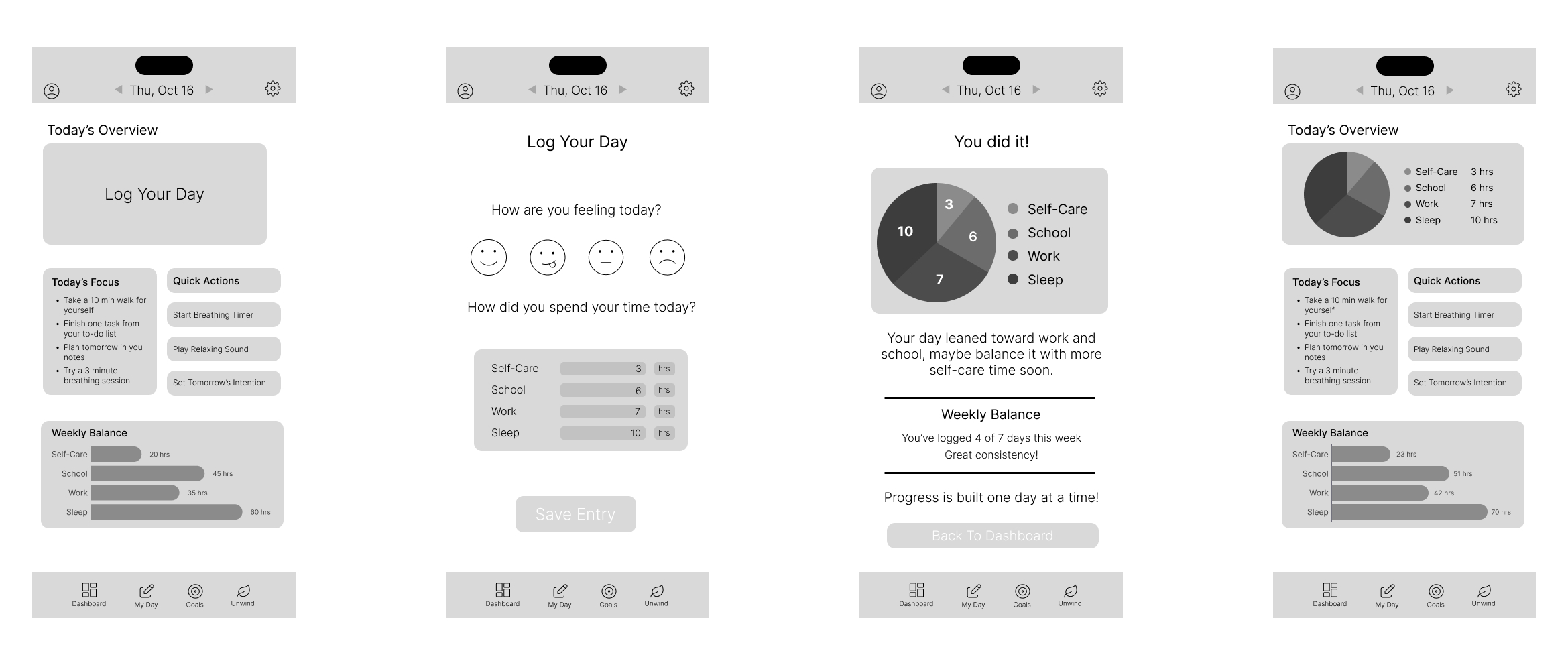
5.5 Dashboard Improvements
- Cleaner Weekly Balance
- Chart now easy to read
- Stronger color contrast
- Simplified layout
The current version of Flowly is clean, friendly, and easy to use.
Key improvements include:
- clear visual hierarchy
- consistent spacing and card styles
- strong contrast
- interactive feedback on taps
- smooth navigation
- more motivating progress visuals
- a UI that feels warm instead of clinical
Flowly is functional and visually consistent, but I want to expand it by:
- reintroducing the calendar feature with a better design
- adding optional streaks or reminders
- refining micro-animations
- adding onboarding screens
- collecting real user feedback to validate flows
- improving accessibility
Working on Flowly taught me:
- how much clarity relies on color, spacing, and visual structure
- how simplifying interactions can make an app feel more welcoming
- that even small animations improve a user’s sense of control
- the importance of iteration; the first version is never the last
- how to design for mobile behavior, not just theory